Beaches App
UX Design · UX Research · Prototyping
Refined and enhanced the user interface (UI) and user experience (UX) of the Beaches App main product
Summary
Problems Identification: Identified problems within the main product with the CEO and marketing team
User Research: Utilized various methodologies to identify solutions for the identified problems
Low-Fidelity Prototypes: Wireframed low-fidelity solutions
Visual Design: Spearheaded a new visual identity for the product
Project Context
Jan - May 2024
Role: UX Designer Intern
Team: 3 people
Tools Used
Figma
Amplitude
Google Forms
Overview
Introduction
Beaches app helps users to find the perfect beach and offers information on beach amenities and activities. I was tasked to to refine the overall UI/UX of the main product as well as prototyping new features.
Design Process

Problem Identification
⚠️ Problem 1: Onboarding
The main product lacked a structured onboarding user interface (UI), leading to user confusion and a steeper learning curve. New users struggled to understand product features, workflows, and benefits, resulting in lower engagement and higher drop-off rates.
⚠️ Problem 2: Free Trial
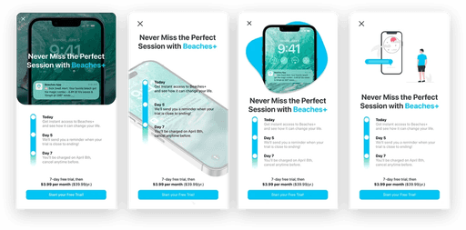
The new premium feature could not be effectively showcased due to the lack of a proper free trial experience. Users were unable to explore and understand the value of premium offerings before committing to a purchase.
⚠️ Problem 3: Beach Screen
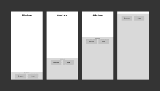
The main product experienced navigation challenges that made it difficult for users to move intuitively through the interface. Poor information architecture and unclear UI pathways resulted in frustration and inefficiency.
User Research
👋 Onboarding
Method: I used user interviews and usability tests because they provide direct insights into where new users struggle, helping identify pain points and opportunities for a smoother onboarding experience. These methods ensured that the solution addressed real user needs rather than assumptions.
Result: I learned that users struggled to understand the app's features and setup process due to a lack of clear guidance. This resulted in me designing a step-by-step onboarding flow with screens for welcome, account setup, subscriptions, favorites, and preferences to ensure users quickly grasp the app’s value and personalize their experience.
🤑 Free Trial
Method: I referred to past research on free trial screens because it offered proven strategies for showcasing premium features effectively. Leveraging this data allowed me to design a solution grounded in successful patterns and user expectations, reducing guesswork.
Result: I found that users were hesitant to start a free trial without a clear understanding of its benefits and timeline. This led me to design a visually compelling free trial experience with a focus on benefits ("Never Miss the Perfect Session"), a clear trial timeline (e.g., Today, Day 5, Day 7), and a prominent call-to-action to encourage signups.
🌊 Beach Screen
Method: I utilized the team’s Amplitude setup because it enabled me to analyze user behavior at scale, revealing patterns like drop-offs and navigation bottlenecks. This quantitative method was essential for identifying where users encountered friction, allowing for data-driven improvements.
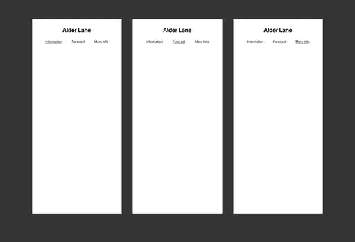
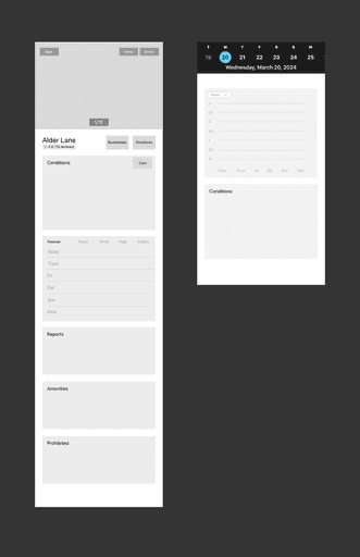
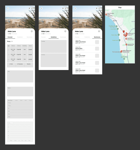
Result: Users had difficulty navigating between forecasts and related local businesses. This insight resulted in me designing a cleaner, tab-based navigation system with improved visual clarity and information hierarchy, ensuring users could easily switch views and find relevant details.
Prototyping
Low-Fidelity Prototypes
Onboarding

Main Screen
Conclusion
Business Impact
I was able to drive a 30% conversion rate from free to paid users by optimizing the user onboarding experience, directly contributing to the acquisition of 300+ new users on the Beaches app within a 4-month period

