iOS Calendar Application Case Study
UX Design · UX Research · Prototyping
Redesigned the Apple iOS Calendar Application by investigating usability issues and gathering user feedback from App Store reviews.
Summary
User Research: Utilized a comparison matrix and secondary user research
Wireframing: Wireframed a solution from the identified problems
UX Design and Prototype: Crafted an iteration of a solution
Project Context
April 2023
Personal Project
Team: Individual
Tools Used
Figma
Photoshop
Goodnotes
Overview
Introduction
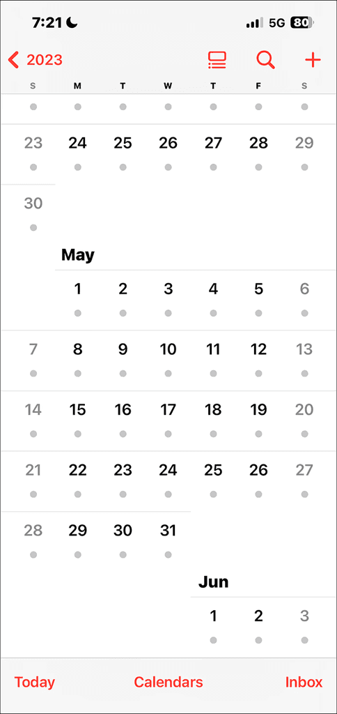
Primarily, I arrange my routine obligations using the Apple Calendar, largely owing to the simplicity availed by the Apple ecosystem, given that the bulk of my resources are Apple devices. Yet, I've noticed that using the Apple Calendar's iOS app becomes progressively burdensome over time.
Design Process
This process allows the identification of usability issues through user feedback, ensuring that real pain points are addressed.

User Research
Methods
I decided that using App Store reviews and a comparison matrix was the most optimal approach for the user research process because it provided direct, unfiltered feedback from real users, highlighting common pain points with the iOS Calendar app.
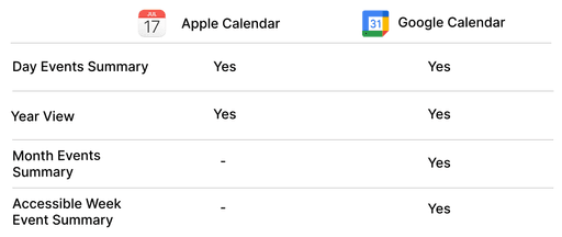
The comparison matrix allowed for an organized analysis of these issues, enabling the identification of key areas for improvement against competitors’ features
App Store Reviews

🙎🏾♂️ “It’s difficult to view my month or week at a glance and see my general business status."
🙎🏼♀️ “When I open my calendar, I want to see a quick view of my month. All you provide is a bunch of dots that tell me I might have something planned that day.”
🙎🏿♀️ “Once upon a time I was able to choose whether the default display was a month, week, or day and it would stay that way. I could tap on a day of the month and that day would open. Now when I tap on an empty date in preparation to enter an appointment the empty date doesn't show up.”
🙎🏻♂️ “All the separate calendars have a color to identify it. But when you're looking at the page that shows the entire month, there's only a dot (.) to indicate there is an entry for that date - that's it.”
🙎🏽♂️ “... add a monthly view that will show what the day's event is by looking at the monthly calendar instead of necessitating clicking on the event.”
Comparison Matrix

Problem Statement

The iOS Calendar app's current design hinders users from quickly viewing their schedule at a glance, particularly in the month view, leading to confusion and inefficiency. Users need a more intuitive, visually clear interface that allows seamless navigation and easy access to their events without unnecessary steps or clutter.
Prototyping
Wireframing

Design Decision
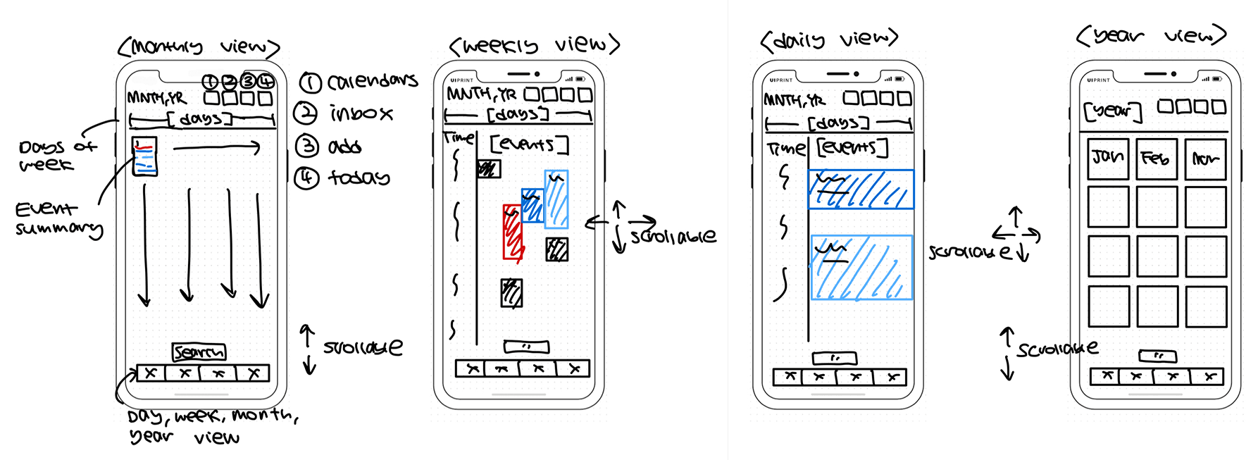
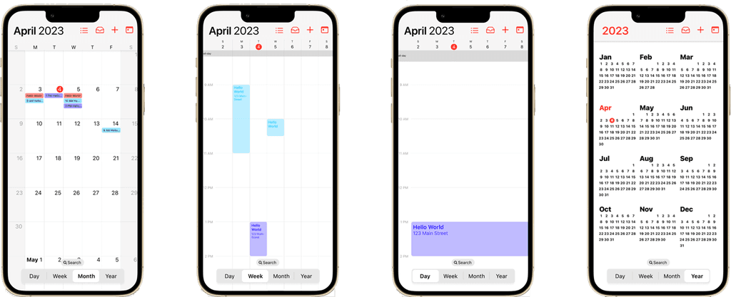
The wireframe introduces a more intuitive layout. A key feature is the navigation bar placed at the bottom of the screen, strategically positioned for easier thumb reach on mobile devices. This bottom bar prioritizes frequently used actions like switching views and searching for events, enhancing accessibility and simplifying navigation. Moreover, I filled the monthly view with much more information and made the week view much more accessible.
Visual Design (Figma Link)

Conclusion
Future Steps
The next steps include conducting user testing to gather feedback on the wireframes and prototype. Insights from testing will guide refinements to improve the design. After iterating based on user input, further enhancements will be explored. Finally, the design will be prepared for development, ensuring it meets both technical and user needs.