IBM Client Engineering: EPIC Dashboard Redesign
UX Design · UX Research · Prototyping
Redesigned EPIC Dashboard for client, Company X.
Summary
User Research: Conducted empathy mapping and pain point analysis to identify usability issues
Prototyping: Designed and developed an interactive dashboard prototype with improved visuals
Handoff: Implemented the frontend using React.js and passed it to an SME
Project Context
July 2024
Role: Innovation Designer
Team: 3-5 people
Tools Used
Mural
Figma
React JS
IBM Carbon Design System
Overview
Introduction
Company X undertook a redesign of their EPIC Dashboard to address critical usability issues, improve real-time project tracking, and enhance decision-making for project managers and product owners.
Client Engineering Process

Research
Discovery Workshop
Understand the client's challenges, goals, and desired outcomes
Design Thinking & Technical Feasibility Assessment
Collaborate with Subject Matter Experts (SMEs) and Platform Engineers to brainstorm, ideate, and validate user-centered solutions that align with technical capabilities and constraints.
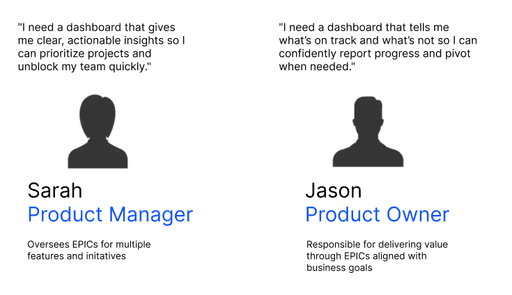
Through empathy mapping sessions, the team was able to identify the following pain points.
Users struggled with multi-step workflows to access specific project insights, reducing productivity.
The RAG status visualization was unclear, leading to confusion about project health.
Poor data prioritization made identifying high-risk or delayed EPICs challenging.
Slow performance and load times discouraged frequent dashboard use.

Prototyping
Wireframing

Design Decision
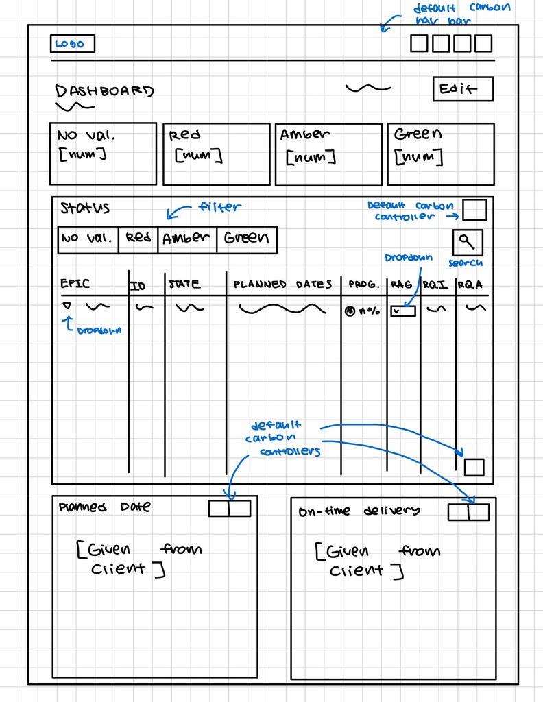
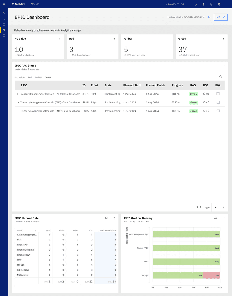
The redesigned EPIC Dashboard improves navigation and visual hierarchy to provide a clear, focused view of project health and progress. Enhanced RAG status visuals and streamlined data presentation prioritize critical metrics, while real-time updates ensure timely decision-making. Customization features, such as filters and tailored views, address diverse user needs for improved usability.
This design delivers a user-centered, actionable tool for Product Managers and Product Owners to monitor and manage EPICs effectively.
Visual Design

Conclusion
Handoff & Next Steps
With the redesigned EPIC Dashboard complete, the frontend was implemented using React.js to ensure a responsive, dynamic, and user-friendly interface. The dashboard was then handed off to a Subject Matter Expert (SME) for validation and further integration with backend systems.